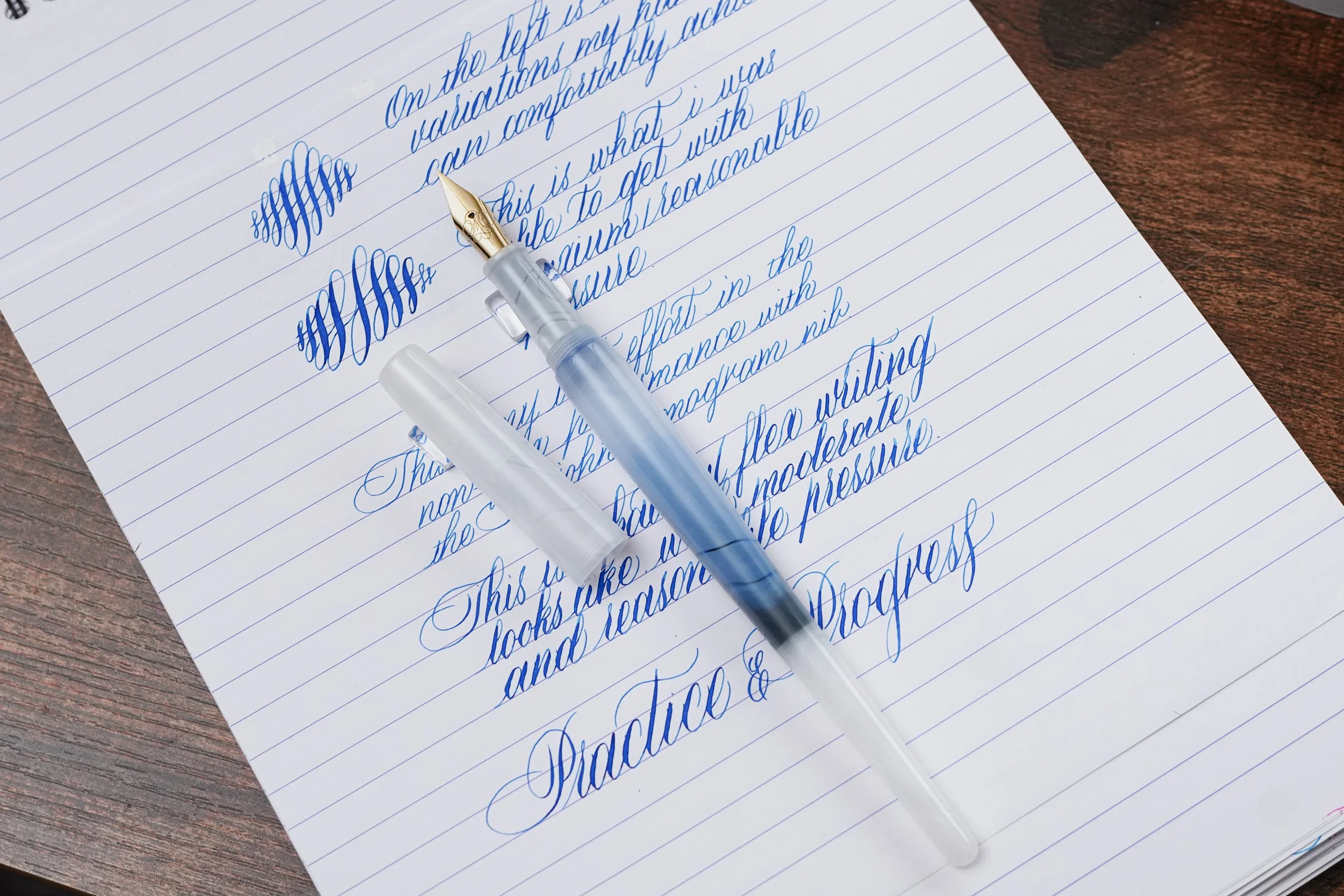
When Majohn introduced its third-generation steel flex nib alongside the L1 fountain pen, I was particularly interested in its advertised line variation of 0.3 mm to 1.7 mm. At under $10 USD for the nib alone, I wasn't expecting exceptional performance. After all, this is an inexpensive steel flex nib. However, what really caught my attention wasn't its maximum line width. It was the 0.3 mm minimum line width. Many commercially available flex nibs start around 0.35–0.4 mm. Having a flex nib capable of producing considerably finer hairlines opens up some interesting possibilities, particularly for calligraphy and penmanship.
After spending some time with the new nib, my experience with this new steel flex nib is quite positive.
Ps: Want to check out my original Majohn Gen 1 steel flex nib review? Please click here.
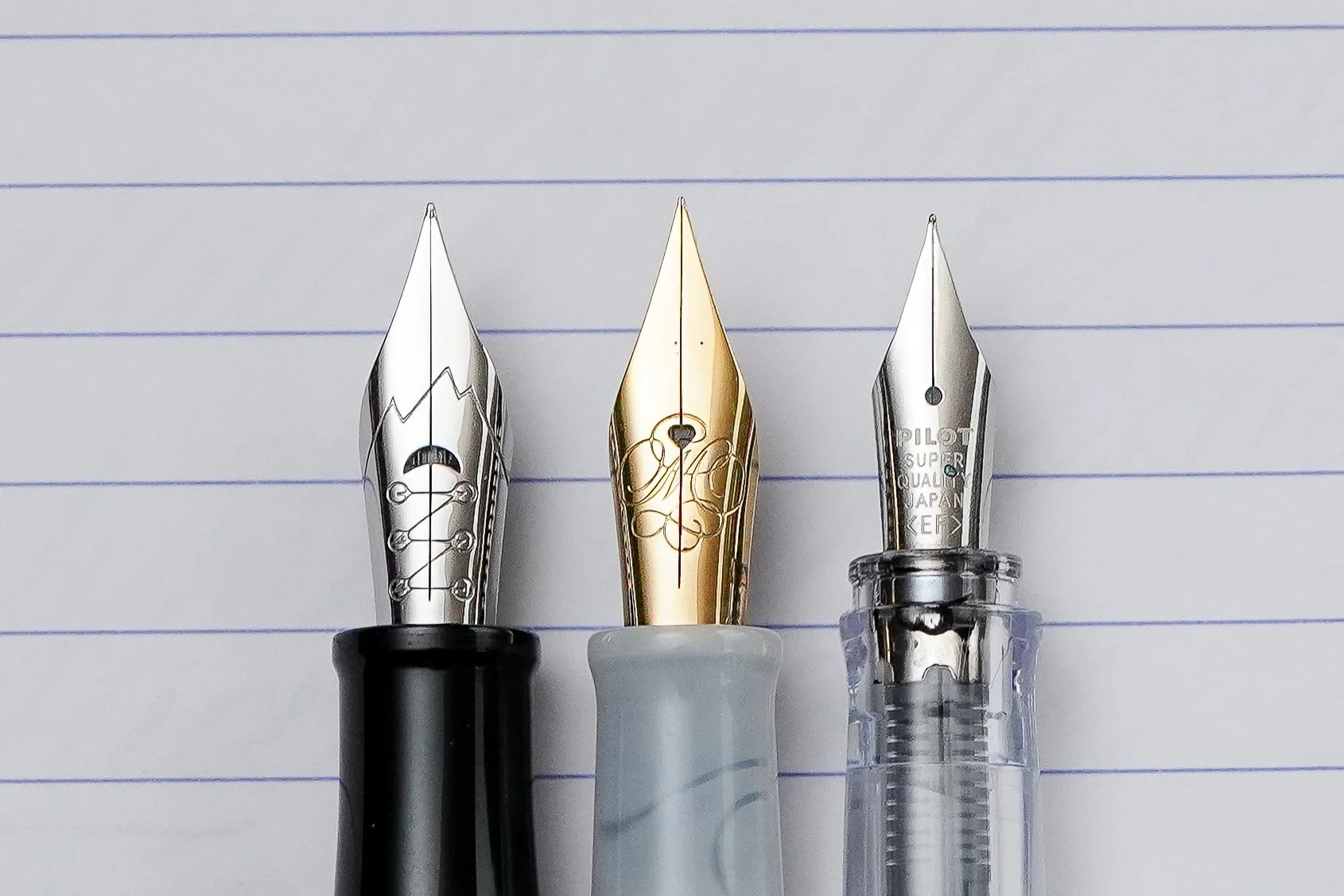
Nib Comparison from left to right (you can see how fine each nib is from the tipping):
Majohn Gen 1 flex nib, Majohn Gen 3 flex nib, Pilot steel EF nib
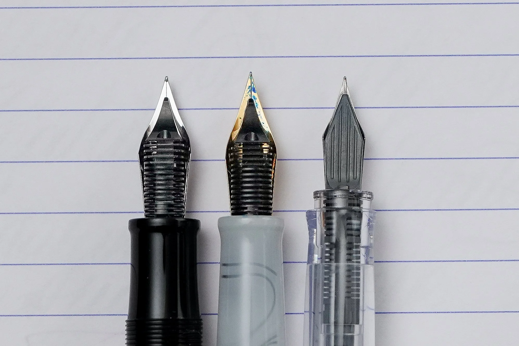
Nib Comparison from left to right (you can see how fine each nib is from the tipping):
Majohn Gen 1 flex nib, Majohn Gen 3 flex nib, Pilot steel EF nib
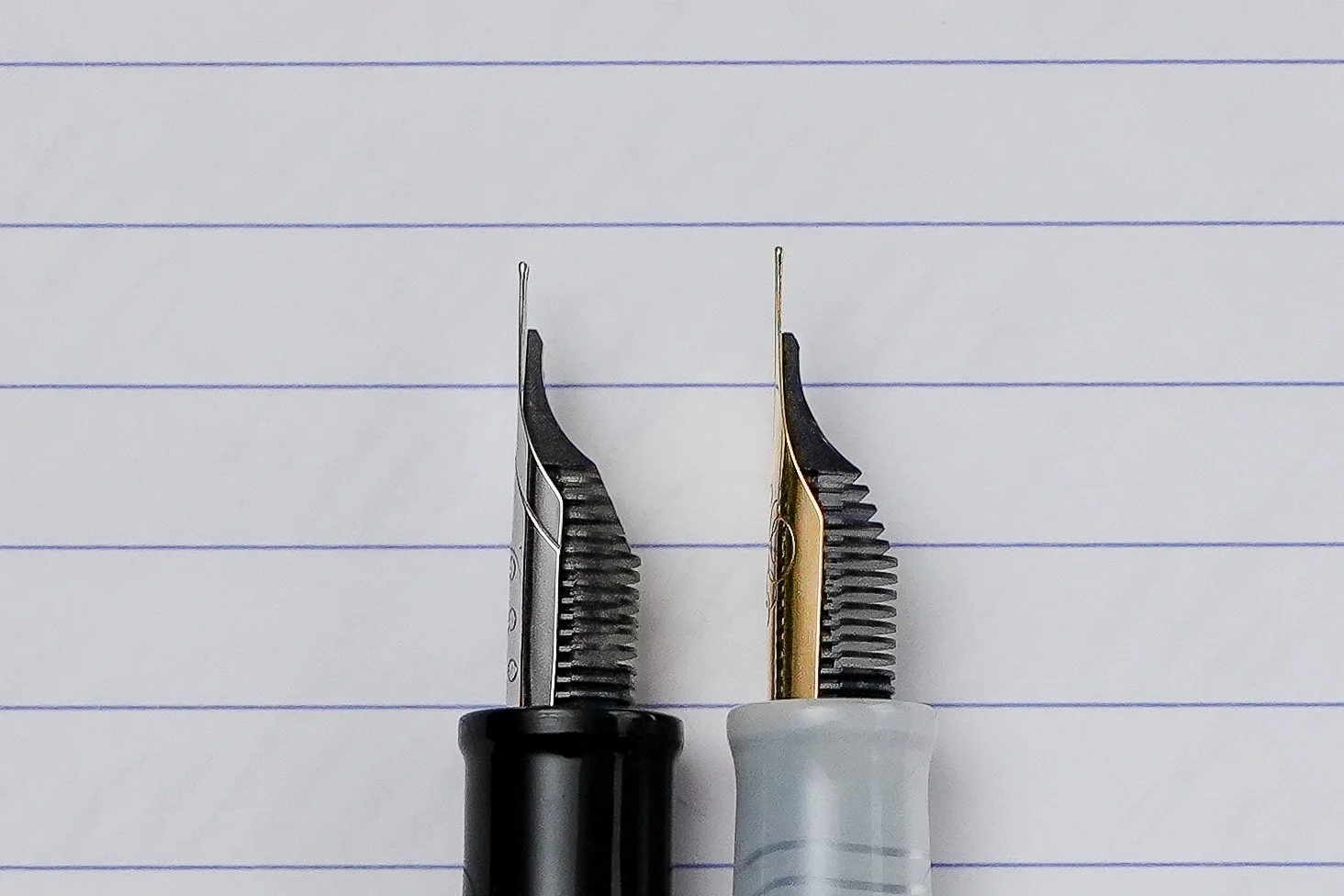
Nib Comparison from left to right (side profile view):
Majohn Gen 1 flex nib, Majohn Gen 3 flex nib
Hairlines
I'll start with what I consider the biggest improvement over the first generation: the fineness of the nib. In my testing, the Gen 3 nib produces hairlines comparable to a Japanese Extra Fine nib (my reference is Pilot steel EF nib in this review). With my relatively light writing hand, I can consistently achieve approximately 0.2–0.25 mm on upstrokes with no pressure. That's even finer than what Majohn advertised as 0.3 mm. However, it should be noted that ink and paper can definitely play an important role in the hairlines. In my testing, I was testing on Marumen paper for the finest hairlines, to be consistent across all my modern flex nibs.
Smoothness
For such a fine nib, I am impressed by its smoothness. I would put its writing smoothness on a similar level to a Pilot Extra Fine nib, which is a particularly good comparison considering Pilot's reputation for producing smooth, fine-point nibs.
I've seen some reports of scratchiness with this new nib, but that hasn't been my experience. It's worth remembering that the finer a nib becomes, the more writing feedback you should generally expect. I own and have used numerous fine and ultra-fine flex nibs, including needlepoint nibs capable of producing lines below 0.2 mm. Based on that experience, I would place the Majohn Gen 3 among my top-tier nibs for its combination of fineness and smoothness.
That said, writing technique for very fine flexy nibs is particularly important.
A tip for writing with very fine flexy nib in general
When making upstrokes, especially during calligraphy, try to apply as little pressure as possible. Rather than pushing the nib across the paper, simply guide it and allow it to glide across the surface. This helps minimize feedback and reduces the chance of the exceptionally fine tip catching on the paper. This is particularly important for people who haven't used a Japanese EF or Western EEF nib before.
If your nib feels excessively scratchy, it's also worth examining its tine alignment under a loop. Such a fine nib can become particularly unforgiving if the tines are misaligned.
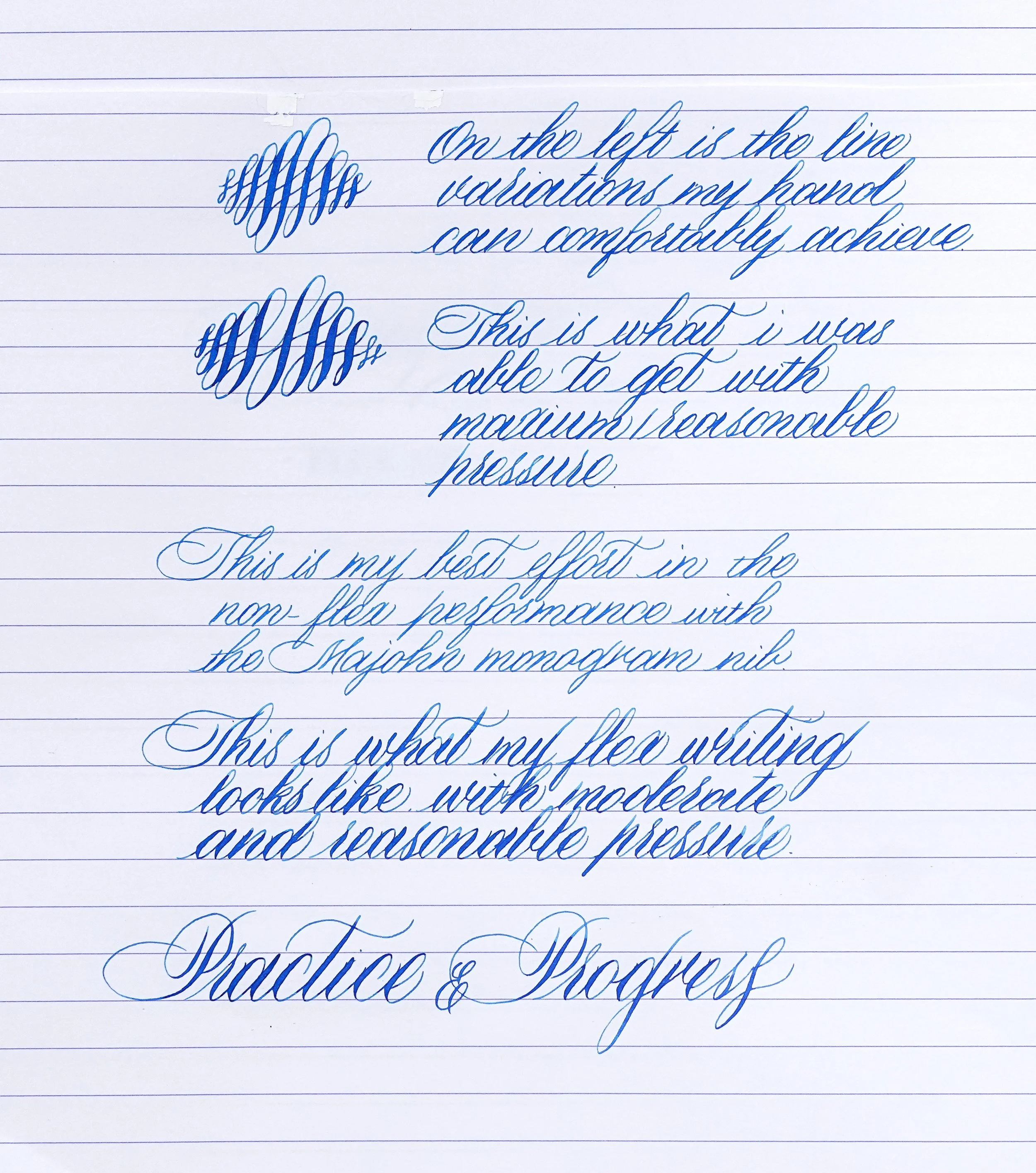
Majohn Gen 3 flex nib writing samples
Paper: Rhodia paper; Ink: Dianmine Florida Blue
Softness and Flexibility – Pressure Required to Flex and How Wide It Flexes
In terms of softness, I don't find the Gen 3 nib dramatically different from the Gen 1. Within what I would consider its semi-flex range, approximately 1.2 – 1.3 mm, the Gen 3 nib feels reasonably soft and doesn't require excessive pressure. However, once you push beyond the semi flex range, the pressure required increases substantially. Getting the nib to open all the way to 1.7 mm requires considerably more force. While it's possible, I wouldn't consider this comfortable or practical for sustained writing. For that reason, I personally classify the Gen 3 as a semi-flex to nearly full-flex nib, rather than a true full-flex nib.
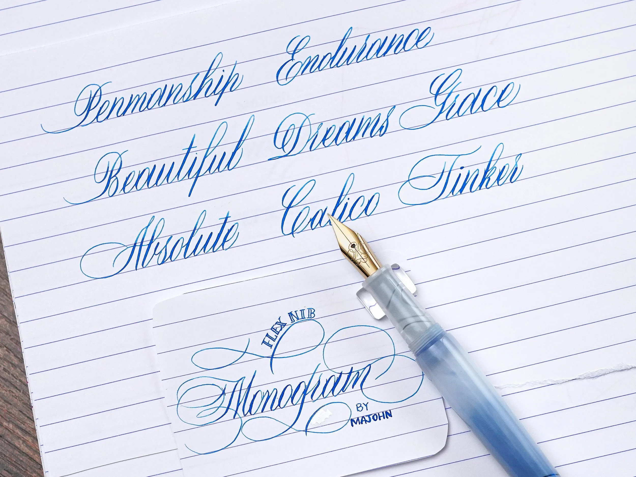
Calligraphy practice writing samples with Majohn Gen 3 flex nib
Paper: Rhodia paper; Ink: Dianmine Florida Blue
Line Variation
Where Gen 3 shines is contrast. Because the hairlines are so fine, even modest downstrokes produce crisp thick-thin transitions. That makes it a strong, affordable option for practicing penmanship or fountain pen calligraphy without a dip pen.
Snapback – Return Speed of the Tines
The snapback is on the slower side, which is expected from stainless steel. It feels similar to Gen 1, which is rated around 5.8 on my Modern Flex Nib Comparison Chart. Achieving crispy line transitions still requires deliberate control.
Ink Flow
Ink flow is surprisingly good in this L1 fountain pen, which is a true eyedropper with an O-ring and no converter hardware. I haven't had skipping or hard starts using Diamine Florida Blue on Rhodia paper. Even at near full flex, I have minimal railroading.
I do recommend keeping the barrel over half full to reduce burping, as with any eyedropper. The temperature from your hand can warm up the air inside the barrel and potentially cause ink blobbing. The ink pooling in the nib did occur to me when I only had a little bit of ink filled.
I also tested the nib on a Jowo No.6 ebonite feed nib unit (from Yongxu not Flexible Nib Factory) in a converter pen using the same ink. There, railroading can occur at maximum flex, so the filling system, feed design, and fit clearly matter. The original plastic feed actually performed better for me.
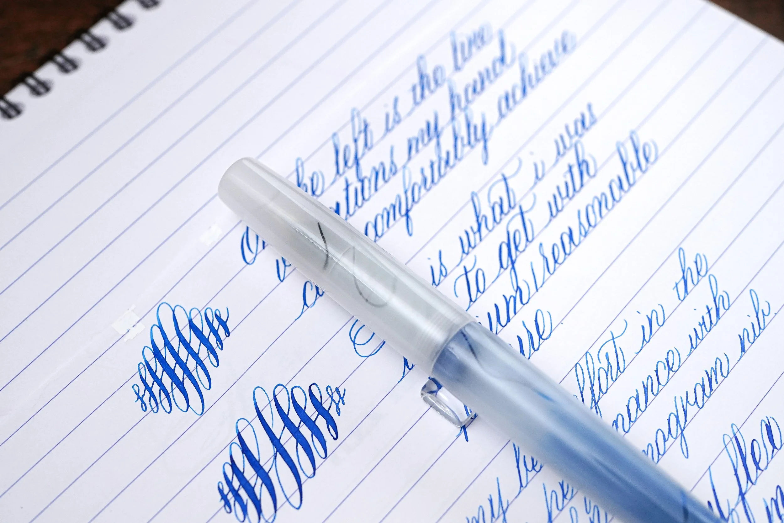
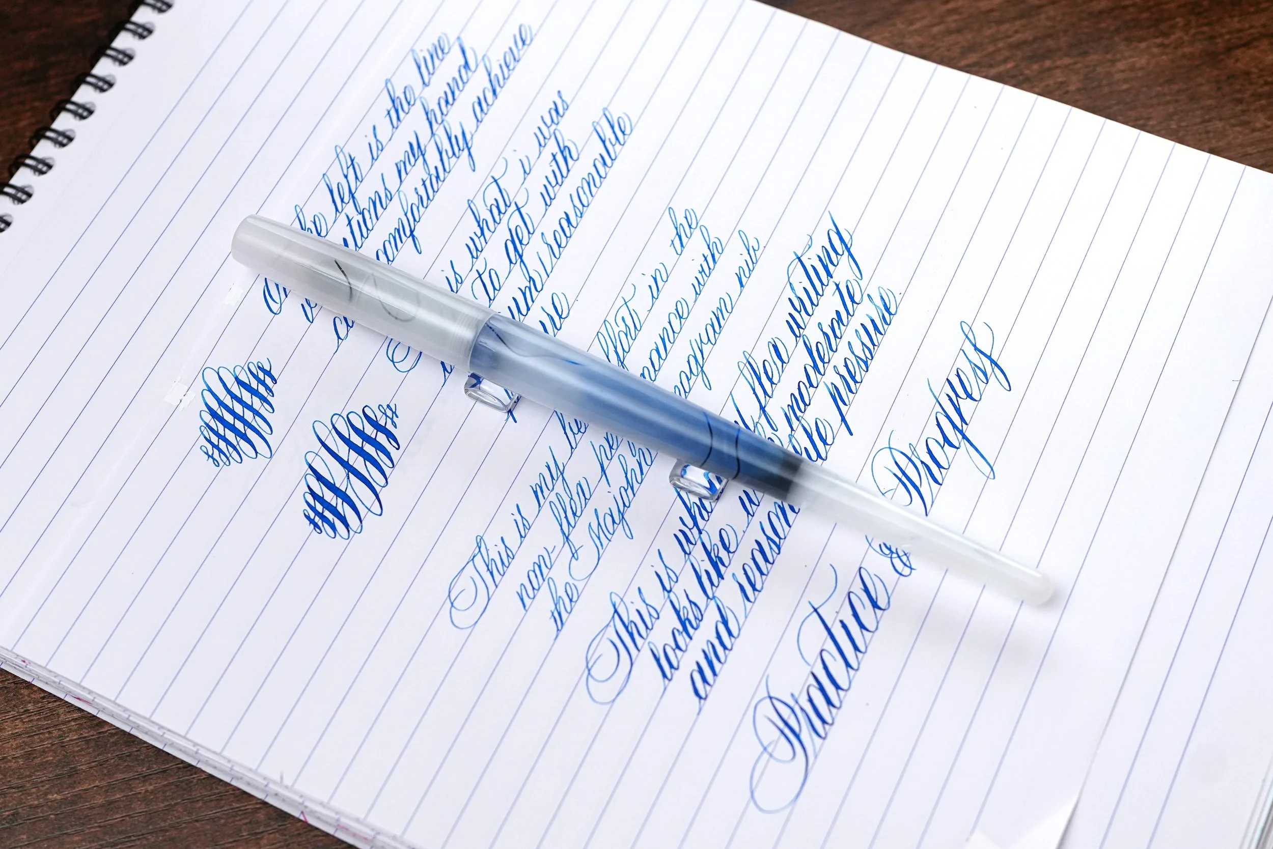
Majohn L1 fountain pen in Hazy Cloud colorway, inked with Diamine Florida Blue. (‘L’ stands for ‘Long‘ for those who are curious about the naming.)
Comfortability of the L1 Fountain Pen
The L1 is a rather long fountain pen, which may be a consideration for portability. Despite its length, I find the overall balance acceptable. My main concern is the grip section. The grip is relatively slender and has a bulge at the end. It then transitions into a noticeably thicker barrel, which eventually tapers toward the end. Aesthetically, I think the design looks quite good. However, I personally prefer fountain pens with a more straight cylindrical profile. While I don't find the L1 poorly balanced, it isn't necessarily the most comfortable pen for my particular grip preference.
For people who prefer other pen bodies, the Gen 3 nib uses the same feed design as the Gen 1 nib, so I would expect some similar compatibility listed in my previous compatibility table. However, I haven't personally confirmed the fit and performance across other Majohn pen models, so this is a reference for consideration.
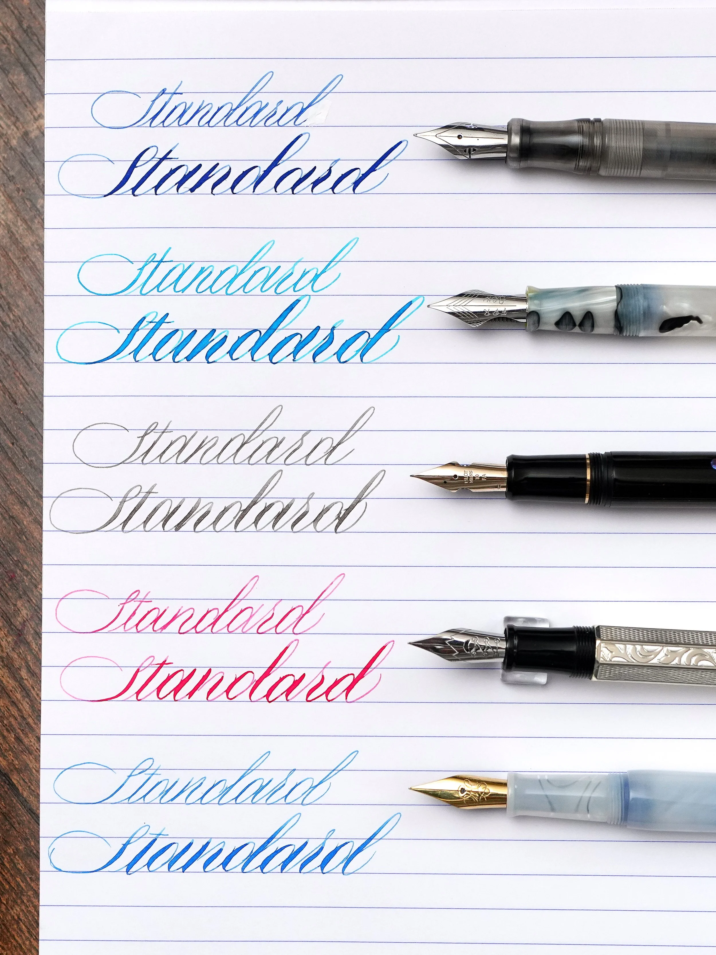
Updated writing sample comparison among other beginner-friendly flex nib fountain pens:
FPnibs modified steel Jowo semi flex nib
Fountain Pen Revolution steel ultra flex nib
Pilot 912 FA nib (post-2022 production)
Majohn Gen 1 steel flex nib
Majohn Gen 3 steel flex nib
Comparing Gen 1 vs Gen 3: Which Should You Choose?
I don't consider Gen 3 a universal replacement or upgrade over Gen 1. Instead, I think the two generations serve somewhat different purposes.
Majohn Gen 1: Better for everyday writing
I stand by my original recommendation. If you're looking for a slightly bouncy nib that can introduce some line variation into ordinary handwriting, the first-generation nib remains a very good option. For note-taking, quick writing, or daily use, I would personally lean toward Gen 1. Its less extreme fineness makes it a more forgiving option when writing quickly.
Majohn Gen 3: Better for deliberate penmanship and calligraphy
Gen 3 is the one I would recommend to someone who enjoys slowing down and paying attention to their handwriting. Its exceptionally fine starting line makes it possible to produce noticeable contrast without demanding large amounts of flex. However, that same fineness also makes the nib more sensitive to pressure and writing technique. Someone accustomed to writing quickly with a heavier hand may find the feedback less pleasant, or even perceive it as scratchiness. For calligraphy practice, though, I see that sensitivity as a reasonable trade-off for the fine hairlines this nib can produce.
Final Thoughts
For my detailed ratings of this nib, please see my updated 19 Modern Flex Nib Comparison Chart. At less than $10 USD for the nib itself, I think Majohn's third-generation flex nib offers excellent value, particularly for people interested in affordable calligraphy practice tools.
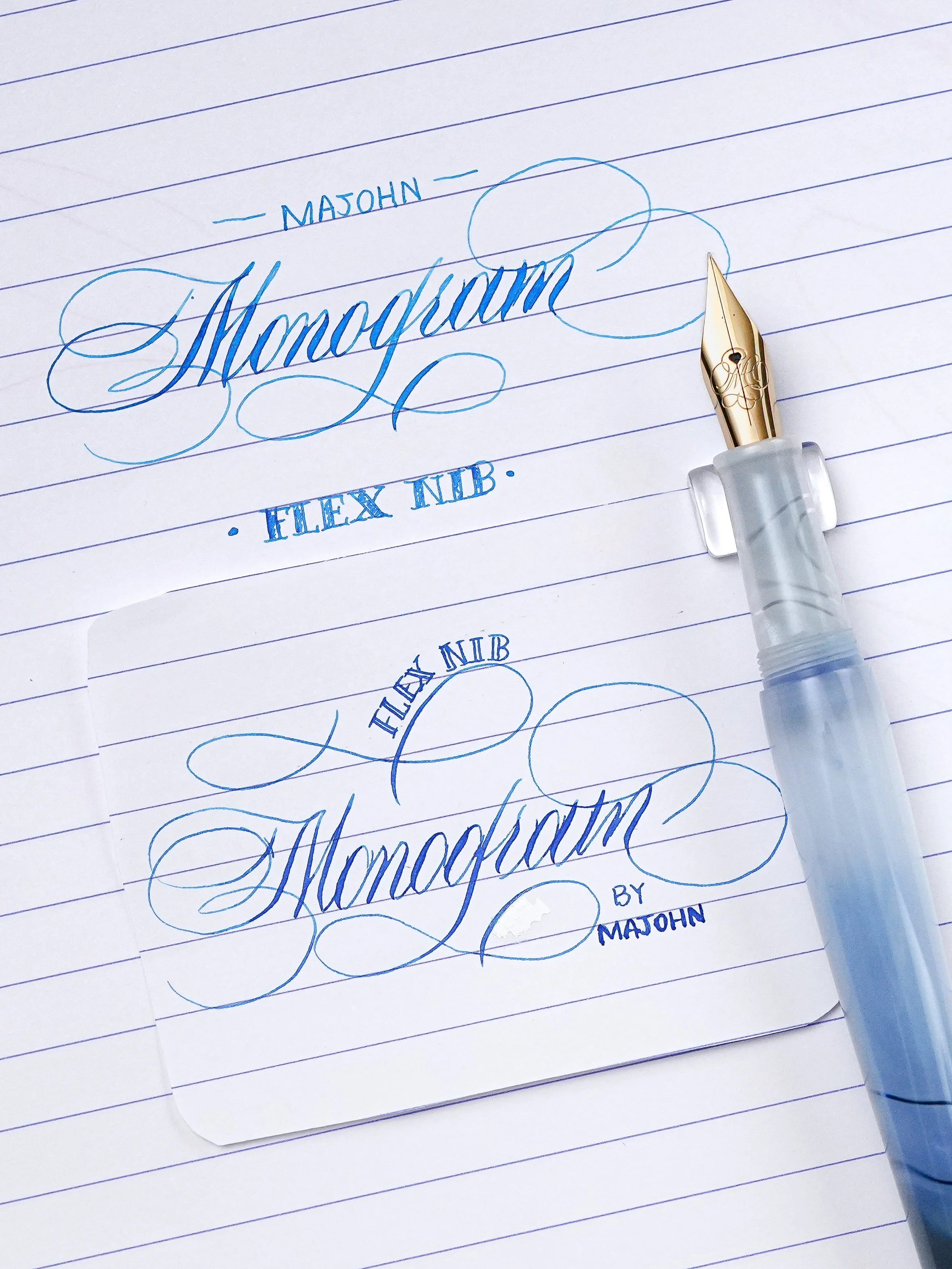
Its strongest feature is the ability to combine exceptionally fine 0.2–0.25 mm hairlines with a reasonably soft semi-flex range. That combination makes expressive writing possible without constantly pushing the nib to its limits.
The snapback and softness haven't changed dramatically compared with the first generation, but the much finer tip substantially changes how I would use and recommend this nib.
If you want a comfortable, bouncy everyday writer for quick notes, I would still recommend Gen 1.
If you prefer deliberate handwriting, want to improve your penmanship, or are looking for an inexpensive fountain pen nib for calligraphy practice, Gen 3 is the more interesting option.
Just remember to keep a light hand on the upstrokes, avoid forcing the nib beyond its comfortable flex range, and pay attention to the feed and filling system if you plan to swap it into another pen.