How I Practice Calligraphy with Flex Nib Fountain Pens
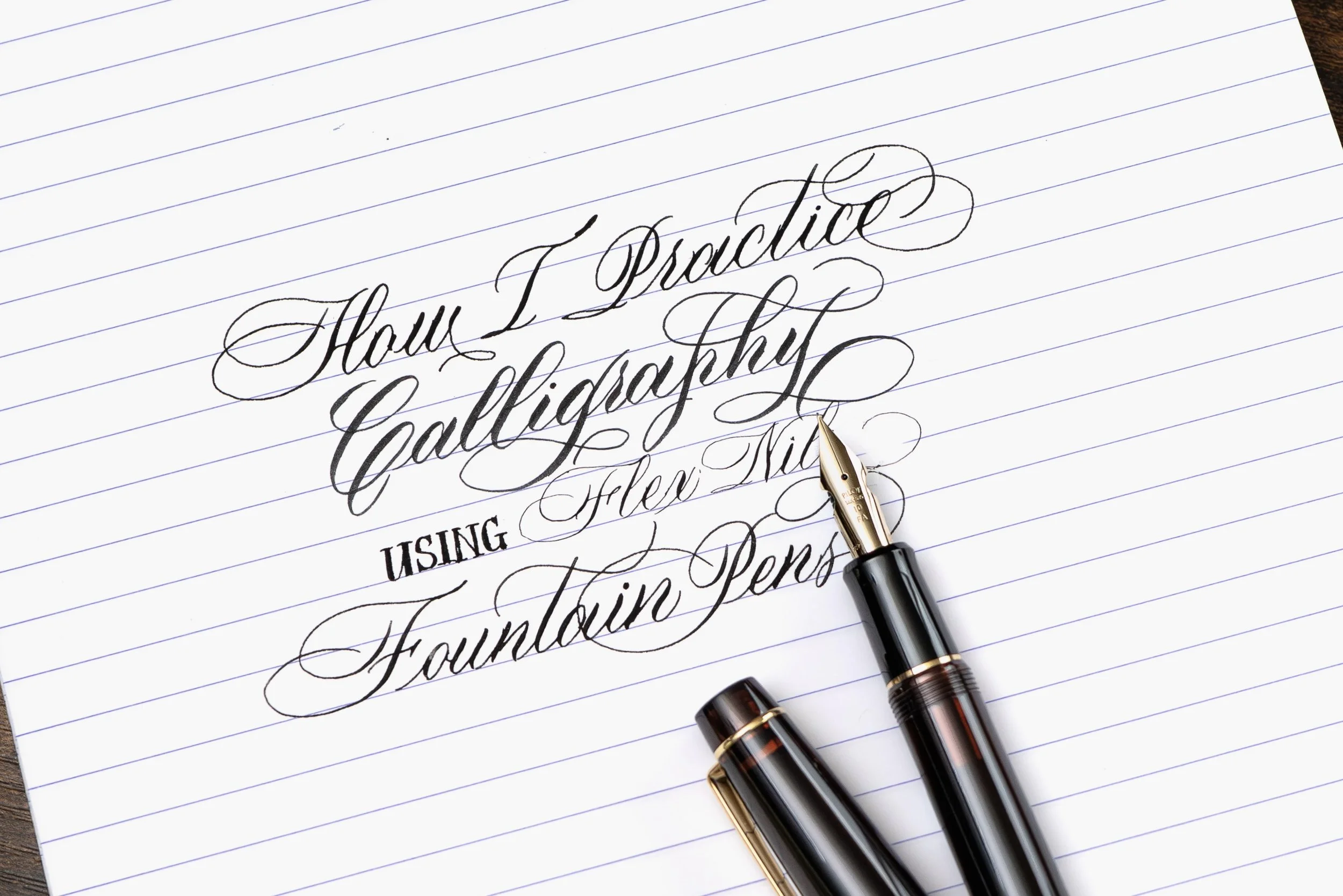
How I practice calligraphy with flex nib fountain pens is probably the second most frequent question I receive. I have wanted to write about this topic for a long time, but there is surprisingly a lot to cover, from positioning the pen, paper, and body to choosing a script, developing better control, and finding supplies that work well with frequent flexing.
Rather than repeating general flex-nib advice that other pen enthusiasts have already explained well, I want to focus on what I have learned from using flex nib fountain pens specifically for pointed-pen calligraphy. I will discuss the techniques and practice habits that helped improve my penmanship, as well as the pens, papers, inks, and learning resources that have worked well for me.
Flex-nib calligraphy remains a niche interest, even within the fountain pen and calligraphy communities. I hope sharing how I practice can answer some of the questions people have about using a flex nib fountain pen for calligraphy.
Before continuing, I highly recommend watching Doodlebud’s video on how to use a flex nib fountain pen. He does an excellent job demonstrating how to hold the pen, position the body and paper, recognize railroading, and understand hairlines. I will not repeat everything covered in his video. Instead, I will add some considerations that I have found particularly relevant to calligraphy.
Part I – Posture and Nib Alignment
Flex-nib fountain pen writing draws heavily from the use of a straight dip pen holder. Historical calligraphy and penmanship books therefore contain useful illustrations showing how writers positioned their bodies, papers, arms, and pens.
The illustrations below come from A Complete Compendium of Plain Practical Penmanship by L. M. Kelchner found in IAMPETH Rare Books. They show how the writer can position the body in relation to the table, place the paper, rest the arms, and align the pen with the writing.
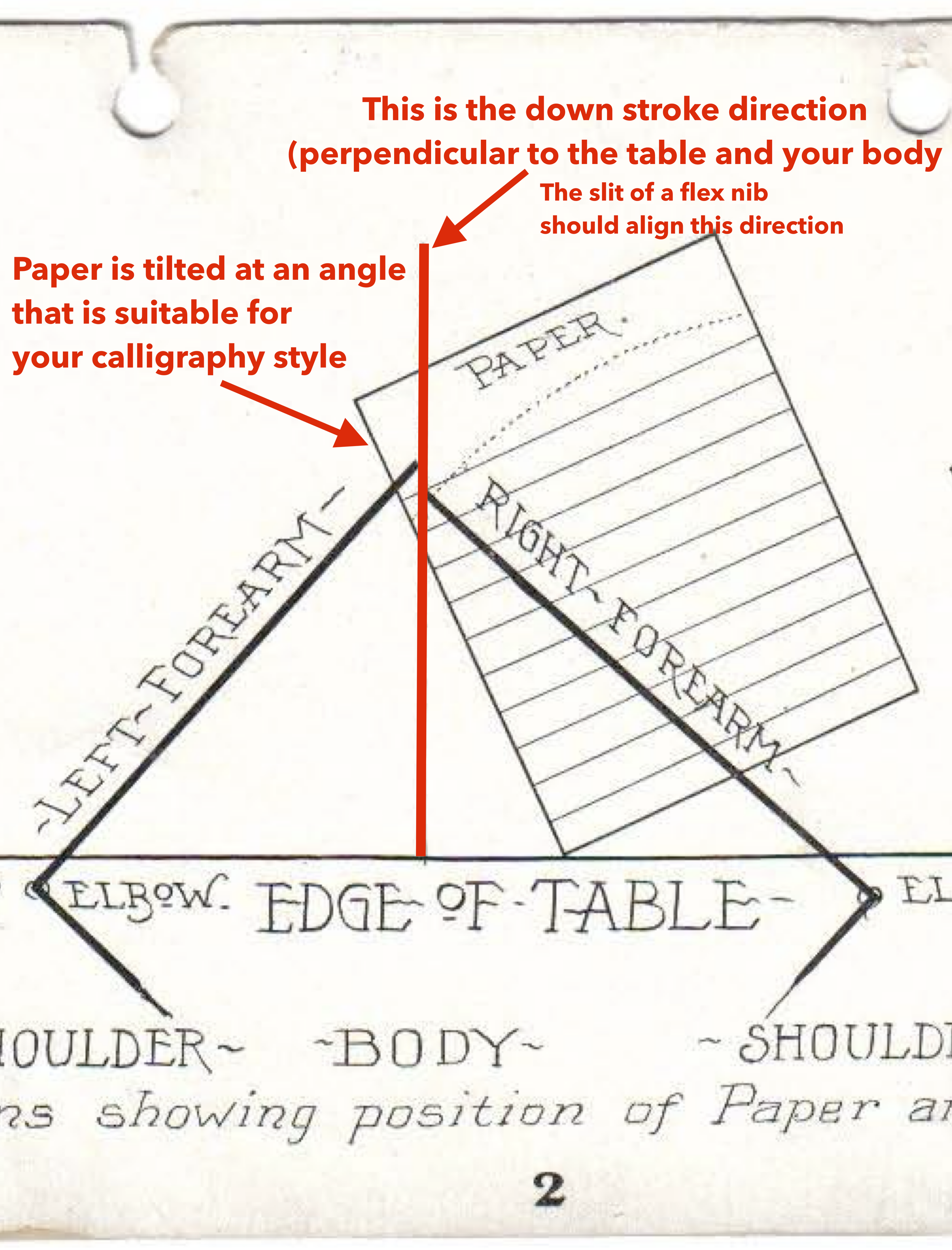
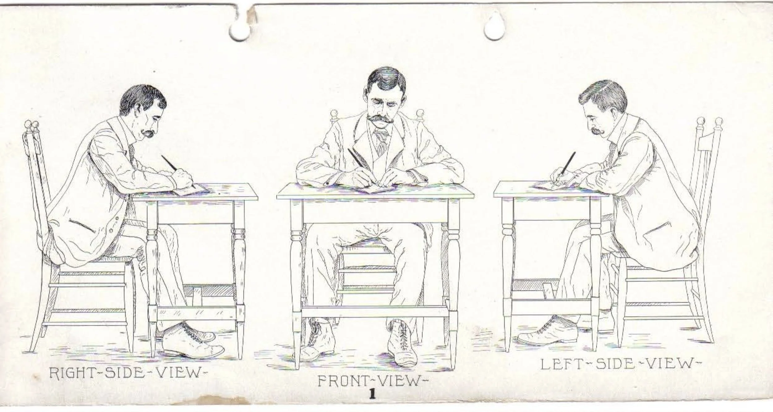
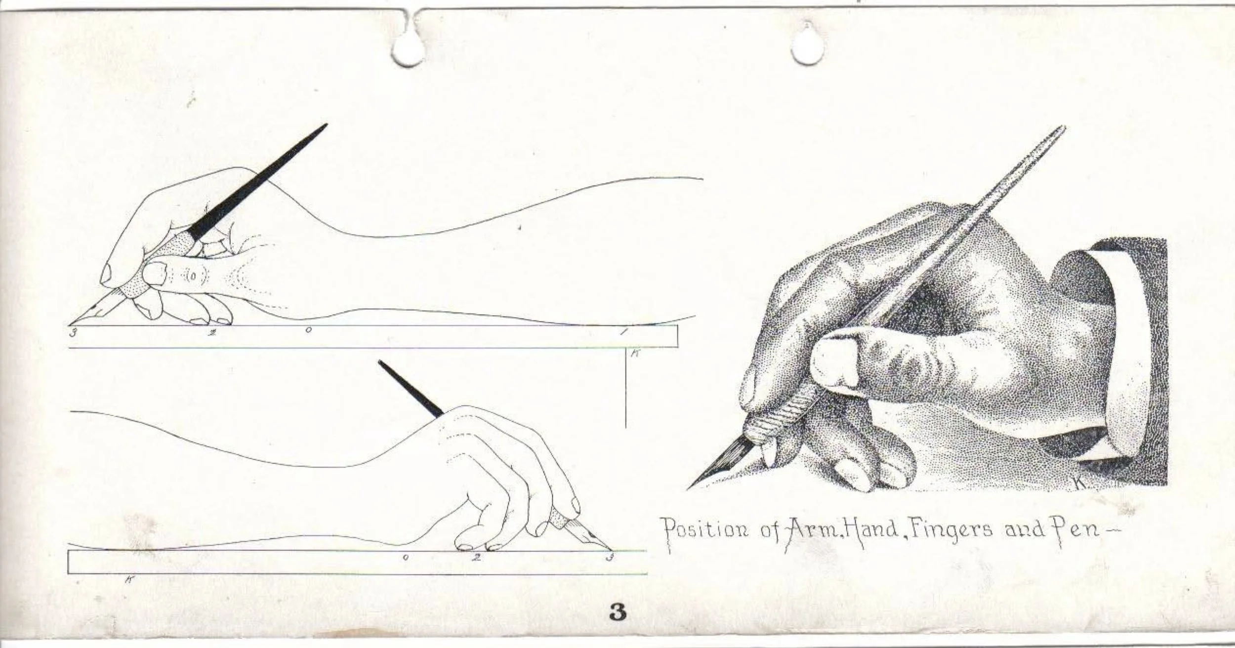
The most important detail is the direction in which the nib points. The nib slit should remain aligned as closely as possible with the direction of the shaded downstrokes. This allows both tines to open more evenly when pressure is applied.
The exact position of the paper may vary depending on the writer’s body, desk, grip, and preferred script. The historical illustration should therefore be treated as a starting point rather than a position that everyone must reproduce exactly.
A note for left-handed writers
The historical illustrations were created for right-handed writers. Because I am not left-handed, I cannot recommend one universal left-handed position.
One possible starting arrangement is to keep the paper relatively upright and adjust the direction of the downstrokes so that the nib slit remains aligned with them.
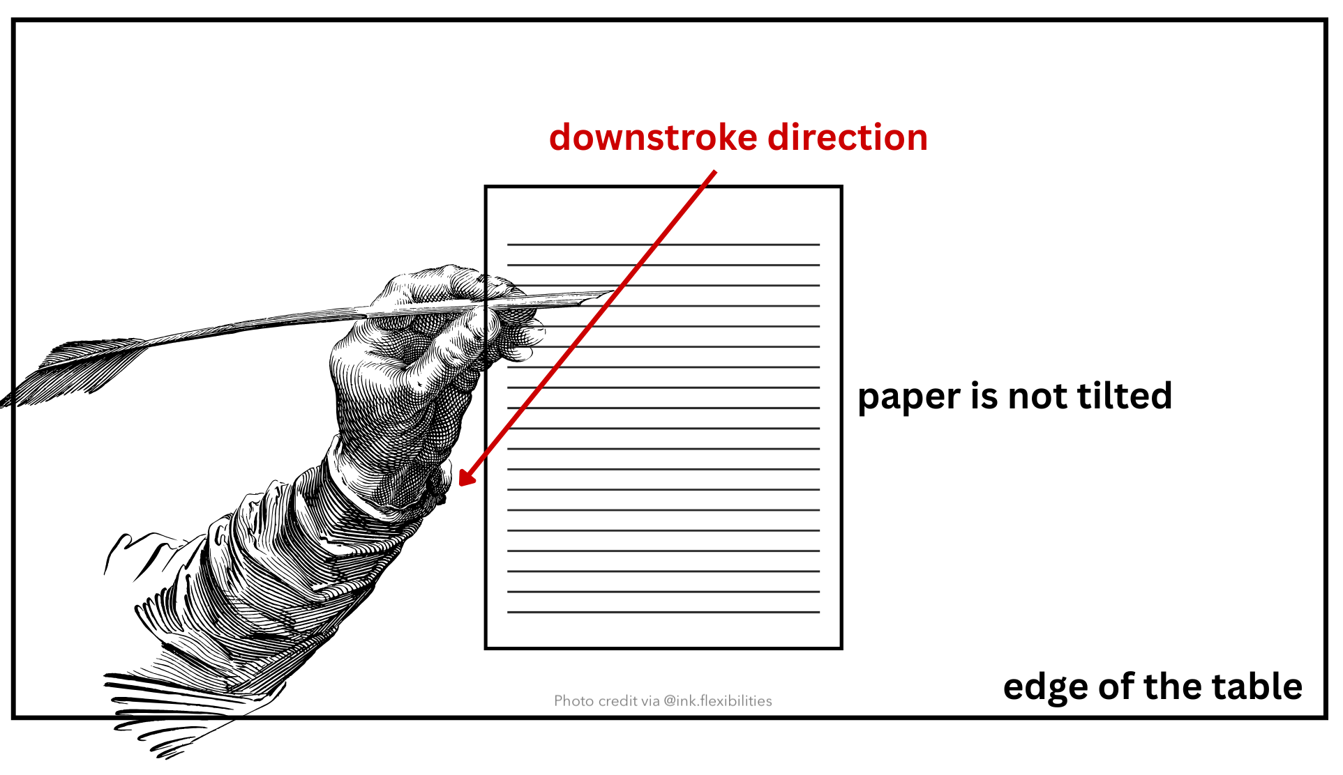
Left-handed writers may need to modify this arrangement depending on whether they write below, beside, or above the writing line. For more detailed advice, I recommend consulting left-handed calligraphers who regularly use straight dip pen holders or pointed nibs.
Part II – Find a Script Style You Like
There are many calligraphy styles to explore. Two of the most familiar pointed-pen scripts are Spencerian and Copperplate. However, I do not necessarily think either formal script is the easiest starting point for someone who has just begun using a flex nib fountain pen.
Instead, I recommend beginning with a modern calligraphy style based on brush-lettering forms. Modern brush lettering generally allows more freedom in letter shapes and does not require the same rigid structures found in formal scripts such as Copperplate or Spencerian Script.
One example is the square corner sometimes seen at the top or bottom of a shaded stroke. With a dip pen, calligraphers may create this effect by slightly changing the nib angle or placing greater pressure on one tine. I would not recommend using uneven lateral pressure in this way with a fountain pen flex nib because it may misalign or spring the tines.
When using a fountain pen, I prefer to draw or refine these corners separately rather than forcing one tine to flex more than the other. Modern brush-lettering styles generally use softer, more rounded transitions, which allows beginners to enjoy line variation without worrying as much about reproducing every formal detail.
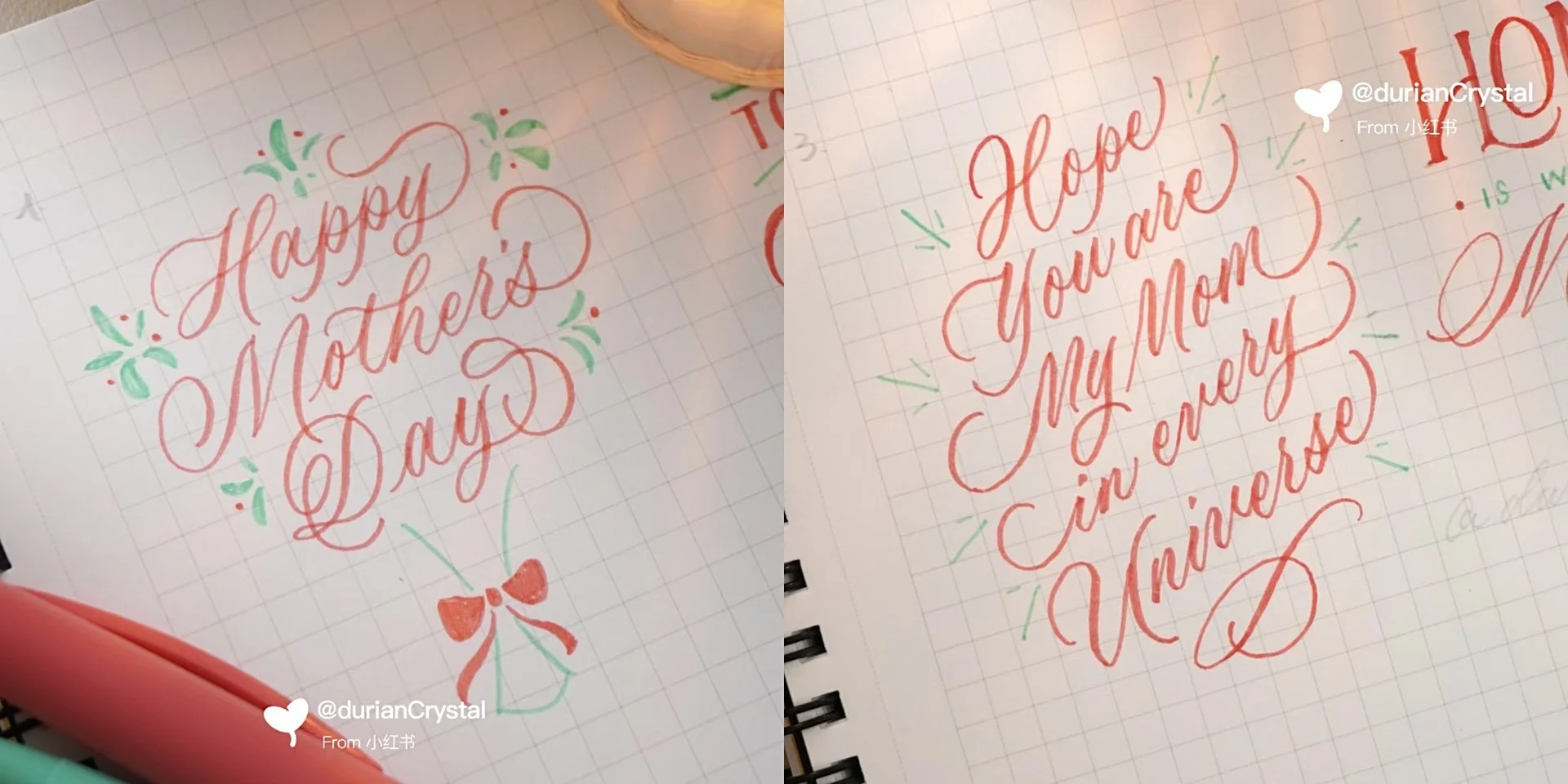
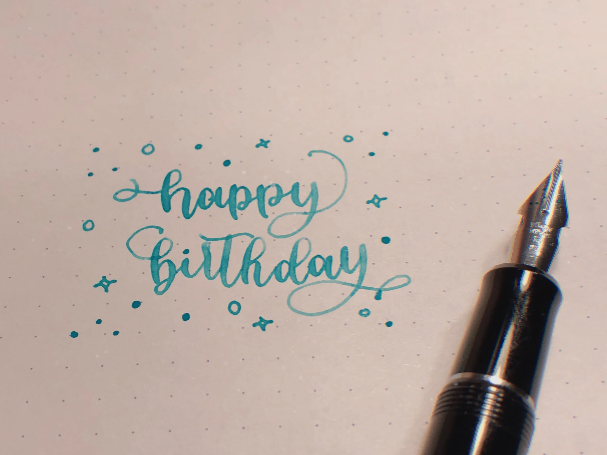
(This is a modern brush lettering example from Crystal Lee @chilliletters, who I have drawn a lot of inspiration from especially in the beginning of my flex nib writing journey.)
The second style I would recommend is Spencerian. Although Spencerian does include shaded strokes and square-edged forms, it does not require heavy shading on every downstroke. This gives the writer more unflexed strokes between shaded strokes and more time to develop pressure control.
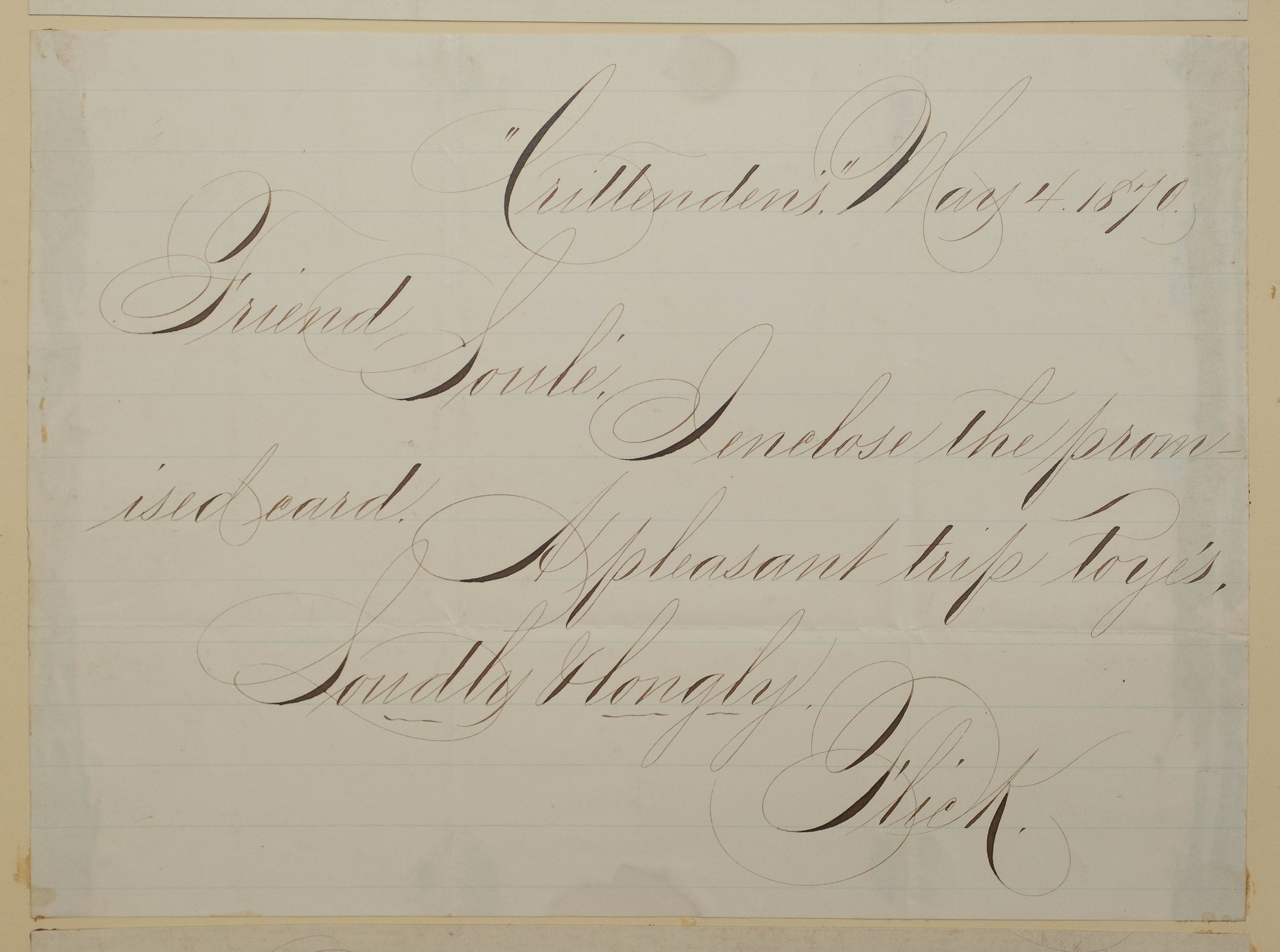
(This is a writing sample of Spencerian Script from JESoule Scrapbook from Mr. Michael G Ward’s Archive)

(This is an example of 2 script styles: Spencerian Script on top v.s. Copperplate Script in the middle, from A Complete Compendium of Plain Practical Penmanship by L. M. Kelchner)
Copperplate has always been one of my favourite styles, so there is also nothing wrong with choosing it as a starting point if it is the style that inspires you most. Just be mindful of how often and how widely you flex the nib. Repeatedly pushing a fountain pen flex nib close to its maximum width may increase the risk of misalignment or damage.
Ultimately, the most important thing is to choose a style that makes you want to continue writing. It does not matter where you begin as long as you begin somewhere.
Part III – How I Learned and How I Practice Now
How I first became interested in flex-nib calligraphy
I first became interested in using a flex nib fountain pen for calligraphy around 2019, after seeing videos of a calligrapher producing beautiful calligraphic writing with a fountain pen.
At the time, I started doing a lot of calligraphy practice with brush pens. I had also tried pointed dip pens, but I never enjoyed using them very much. Because most pointed dip nibs are untipped, I found the writing sensation too scratchy. I also hated having to dip the nib again every few words when writing something like Copperplate. It was simply not sustainable for the way I wanted to practice.
I started using flex nib fountain pens for calligraphy around the end of 2020. I bought my first serious flex nib fountain pen: a Pilot Custom 912 with an FA nib. The convenience and smoother writing experience made fountain pens much more enjoyable for me.
In the beginning, I mostly copied alphabets and tried writing words immediately. I did not spend much time practicing basic strokes because I simply wanted to enjoy the pen and start writing. Looking back, this was probably one reason my improvement was relatively slow at first.
Here is one of my earliest writing samples. (Mar. 2021)
A flex nib will not automatically improve your handwriting
One of my biggest misunderstandings was believing that buying a flex nib fountain pen would immediately make my handwriting look like a finished calligraphy piece.
Of course, I eventually realized that a flex nib only gives the writer the ability to produce line variation. It does not automatically create better letter shapes, proportions, spacing, slant, or pressure control.
Improvement still requires deliberate practice and some systematic learning. For me, that meant using workbooks, studying other people’s calligraphy, and searching for examples of how particular lowercase letters should be formed or connected.
I also began saving and printing writing samples from calligraphers whose styles I admired. Their writing represented the kind of work I wanted to produce, so I used their pieces as references and inspiration.
A flex nib can make beautiful writing possible, but the pen itself cannot replace practice.
My practice has never followed a strict routine
Even after several years, I still do not have a fixed practice routine.
Sometimes I write whatever comes into my head. Sometimes I use words or phrases from a song I am listening to. During periods when I am actively trying to learn, many of my practice words come from workbooks or calligraphy posts on Instagram.
My practice schedule has also changed depending on how much free time I have. During more active periods, I might practice for two or three hours, four or five times per week. When I am busy with school, I may only write for one or two hours twice a week.
I do not believe that everyone needs to follow one exact schedule. What has mattered more for me is continuing to return to writing, studying letterforms, and making a conscious effort to improve over time.
Writing is also a form of meditation for me. I do not always sit down with a particular target that I need to accomplish. Sometimes a successful practice session is simply one that allows me to slow down, enjoy my pens, and write.
Repeating individual letters helped me improve faster
Although I initially jumped directly into writing words, I eventually found that I improved much faster when I focused on one letter or basic form at a time.
I would choose a letter from a workbook or Instagram post and repeat it until its shape became closer to the reference. Once I became more comfortable with that letter, I would move on to another one.
This helped me more than repeatedly writing complete words without paying close attention to the individual letterforms.
Basic strokes can feel boring, which is why I avoided them in the beginning. However, looking back, I believe that practicing basic strokes and repeated letterforms produced some of the greatest improvements in my writing.
When I am learning an unfamiliar letterform or flourishing movement, I write very slowly. At first, I did not yet have the muscle memory to know how my fingers, wrist, and arm should move or how much pressure I should apply.
Writing slowly gives me better motor control and allows me to understand the movement. I only begin increasing my speed after I can reproduce the shape consistently at a slower pace. Even now, slowing down usually helps whenever a letter or flourish is not coming out the way I want.
How I use references
When I see a calligraphy piece that I like, the letter shapes are usually what catch my attention first.
Copperplate has always been one of my favourite styles because of its elegant letterforms and the contrast between thick and thin strokes. However, because I began with brush lettering, I also enjoy styles that combine the freedom of brush lettering with elements of Copperplate and Spencerian.
I actively looked for calligraphers who used brush pens to produce Copperplate-inspired writing because I wanted to find examples that combined the two approaches.
I often print calligraphy examples from Instagram or display them on my iPad beside my practice paper. Because I have a printer at home, I can adjust the image to approximately the same size that I want to write.
Very early in my practice, I sometimes placed tracing paper over a printout and traced the letterforms. I did not enjoy writing on tracing paper, so I only did this for a short period. After that, I usually placed the reference beside my paper and copied it by observation.
For formal calligraphy study, the goal may be to reproduce the instructor’s letterforms as accurately as possible. However, I write mainly for enjoyment and am not trying to become a professional calligrapher.
I may initially try to reproduce a letter accurately, but I gradually adapt it to my own writing. My current handwriting combines features from brush lettering, Copperplate,and Spencerian. I tend to select individual letterforms and movements that I like and bring them together.
Workbooks and Instagram serve different purposes
Instagram posts give me inspiration and introduce me to individual letterforms or flourishing ideas that I may not have considered before. However, they do not always provide a complete or systematic way to study an entire alphabet.
Workbooks are useful because they normally include each lowercase and uppercase letter in a consistent style. They also provide details about proportions, the width of shaded strokes, and where a stroke should transition from thin to thick.
I have used or referred to the following resources:
Chilli Letters (DurianCrystal), EP Lettering, Love Leigh Loops — These are social media accounts rather than a workbook. I have drawn a great deal of inspiration from their brush-lettering pieces, many of which work well as references for flex-nib calligraphy. I often print the images or keep them open on my iPad while practicing.
Nina Tran – Her work has inspired my calligraphy for a long time. I especially recommend looking at her posts if you are interested in both Copperplate and Spencerian.
Copperplate Script: A Yin and Yang Approach by PAScribe– This is a comprehensive Copperplate workbook that covers basic strokes, drills, lowercase & uppercase letters, exercises, words, etc.
Benjawan’s Copperplate workbooks– Her flourishing workbook has probably had the greatest influence on my current writing. I learned many of the flourishing forms I now use from that workbook.
I have also learned from many other calligraphers on Instagram, although I unfortunately did not keep track of every account that influenced me.
Guide sheets made an immediate difference
I started using guide sheets after realizing that owning a flex nib fountain pen was not enough to improve my writing.
Guide sheets helped make my slant, height, and spacing more consistent. Even when the individual letter shapes are not perfect, maintaining a consistent slant angle can make the entire piece appear much more harmonious.
The exact settings depend on personal preference and the pen being used. After experimenting with different arrangements, I generally prefer an x-height of approximately 4.23 to 5 mm and a slant angle of 52 ~ 55 degrees.
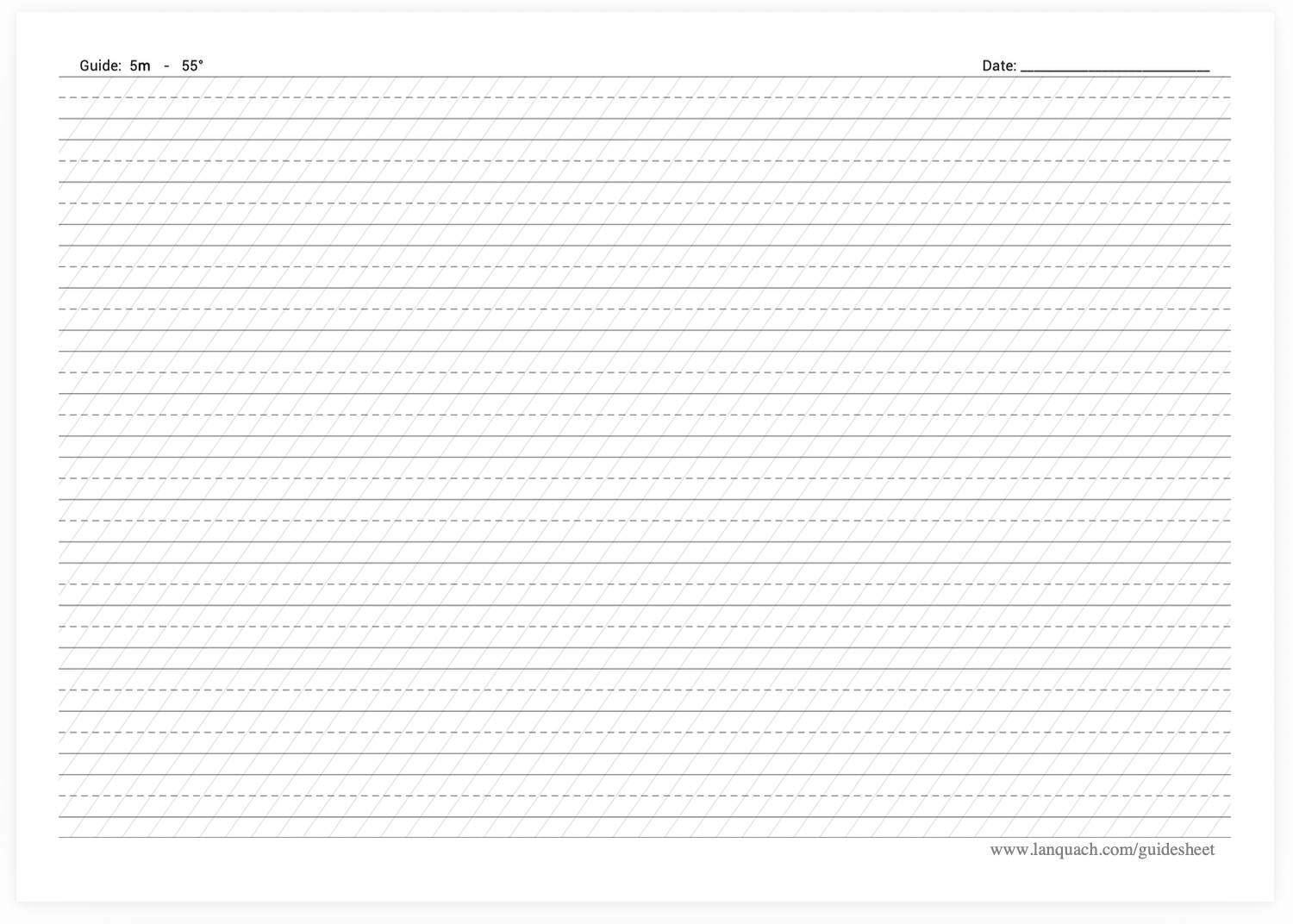
However, I do not think these settings will work for everyone. Different nib widths, levels of flexibility, and writing styles may require different proportions.
This is also why I may use different guide sheets for different pens. A nib that produces broader shades usually needs larger letters, while a finer nib can work with a smaller x-height.
When I use a guide sheet, I normally stay with one pen or several pens that produce a similar writing size. If I am practicing without a guide sheet, I often switch between several pens and nibs during the same session. There is no technical reason for this—I simply enjoy rotating through my flex nib collection.
Lanquach’s guide-sheet generator is my preferred website for creating custom sheets. It allows the user to adjust the slant angle, letter height, spacing, and other measurements. I save the completed guide sheet to my computer and print it directly onto fountain-pen-friendly paper. I usually use Maruman A4 loose-leaf paper.
Learning to value hairlines and snapback
Thin hairlines have always been particularly important to me because they are one of the main features that make calligraphy look elegant.
When I was new to flex-nib writing, I experimented with many combinations of ink and paper. I became frustrated whenever an overly wet ink made my upstrokes look too thick.
Over time, I had many of my flex nibs ground to needlepoint because the finer tipping helped me produce the hairlines I wanted.
However, the issue that frustrates me most is slow snapback.
My writing is closer to English Roundhand than Engrosser’s Script, so I generally do not disconnect every downstroke from the following upstroke. If the tines cannot close quickly enough after flexing, the transition from the shaded downstroke into the hairline can look sluggish and heavy.
This is why snapback is one of the most important qualities I consider when choosing a flex nib. I have learned some methods for working around a slower snapback, which I discussed in my separate article about achieving thinner hairlines, but I still strongly prefer nibs that recover quickly.
Mistakes taught me to be more conservative with flexing
I misaligned several flex nibs when I was beginning to practice. I also broke the tipping from my first vintage Waterman fountain pen. Those experiences taught me that every nib has a limit. A nib may be capable of producing a very wide stroke occasionally, but that does not necessarily mean it should be repeatedly pushed to that width during normal writing.
I am now much more conservative with pressure. Extreme flexing does not automatically create better writing. The proportions, letter shapes, spacing, and transitions between strokes are far more important than producing the widest possible line variation.
When I experience railroading, the first thing I check is whether the pen still contains enough ink. Next, I consider whether the feed is keeping up and whether it needs to be primed. I also check whether I am writing too quickly.
Because I already know which ink-and-paper combinations usually work with my pens, I do not normally change the ink or paper first unless the problem continues.
Looking back at my progress
The greatest change in my writing is not simply that my shades have become wider.
My current writing has more harmonious transitions between downstrokes and upstrokes, taller letterforms, more consistent slant and spacing, and more precise pressure control as the strokes move from thin to thick.
Adding flourishing elements was also an important turning point. Once I began incorporating flourishes into my writing, I felt that my work had improved noticeably. I also began receiving more compliments on my writing.
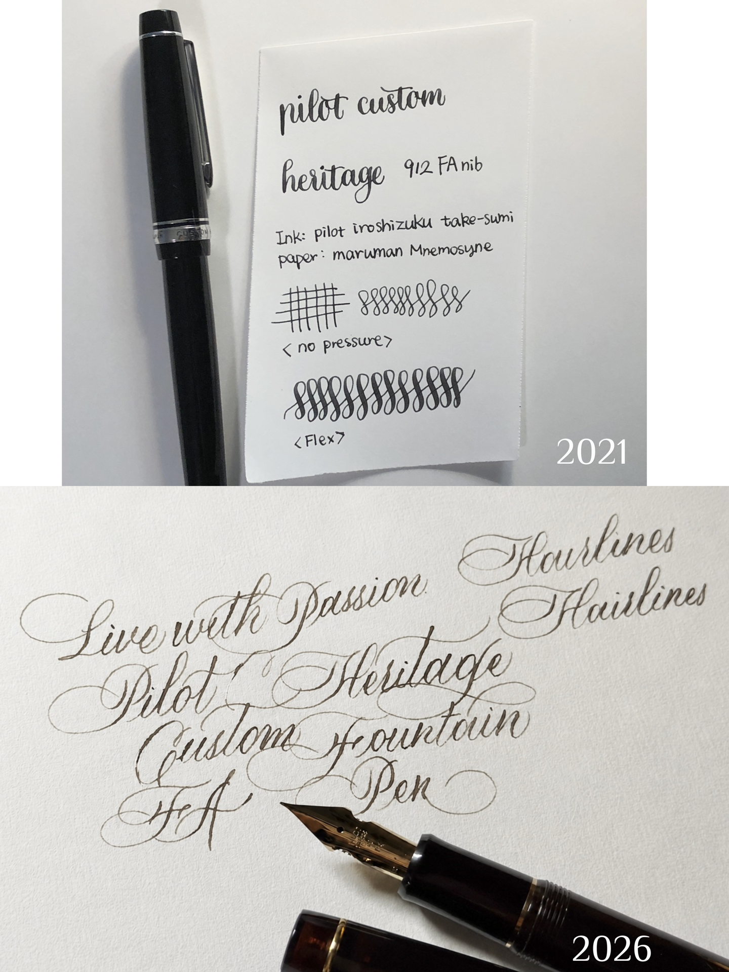
There is still a great deal I want to improve. My slant and spacing can become inconsistent when I write a longer piece. I also want to learn more ascending-loop variations rather than relying on the same one or two flourishing styles.
Another area I want to develop is the overall layout of a complete composition. I normally write freehand without drafting the layout in pencil, so planning a balanced piece is something I still need to work toward.
If I could give my earlier self one piece of advice, it would be to start slowly and understand that a flex nib fountain pen will not automatically improve the writing.
Deliberate practice is still necessary. Basic strokes may not be the most exciting part of calligraphy, but they create the foundation for almost everything that follows.
Part IV – Recommended Supplies
Pen/Nib
It is difficult to recommend one flex nib fountain pen without knowing the one’s preferences regarding softness, hairlines, flexibility, and snapback.
The Fountain Pen Revolution Steel Ultra Flex nib remains my first recommendation for many new and inexperienced writers. It is relatively affordable and offers a good balance of flexibility, softness, and snapback.
For additional options, see my previous article about beginner-friendly flex nibs and my modern flex nib comparison table.
My personal preferences include the Pilot Custom 912 FA nib, nibmeister-modified flex nibs from my comparison table, and all my Victorian Era gold dip nib fountain pens.
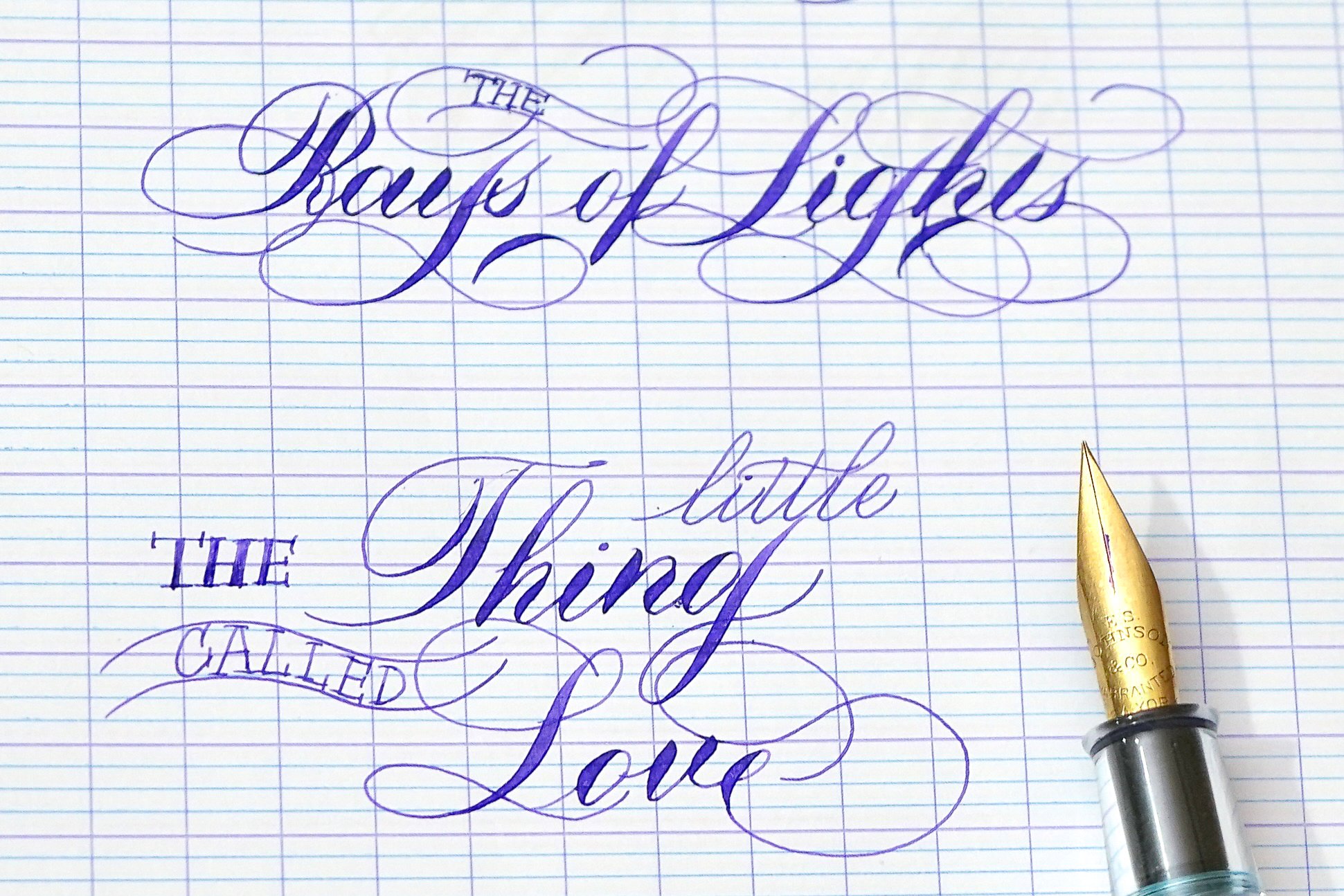
The Pilot Custom 912 FA started my flex-nib calligraphy journey and will always hold a special place in my heart. Many of my nibmeister-modified flex nibs have also been ground to needlepoint. The finer tipping makes my scripts look more elegant and allows me to achieve visible line variation without flexing the nib as widely. Vintage gold dip nibs are probably my favorite. They have the greatest snapback while remaining soft and flexy. The majority of them have very fine tips, so I can write hairlines with no issues.
Paper
There are many fountain-pen-friendly papers available, and I will not attempt to list all of them here.
The main consideration is finding an affordable blank paper that can be used with a printed guide sheet. Because flex nibs deposit a large amount of ink, the paper also needs to resist excessive feathering and bleeding.
The papers I use most often include:
Maruman A4 blank loose-leaf paper – Affordable, easy to print on, and excellent for showing fine hairlines. It also handles the heavier ink flow of flex nibs well.
Rhodia spiral notepads – Relatively affordable and widely available. I most often use the grid or lined versions.
Clairefontaine French-ruled notebooks – I like French ruling when I want to write at a smaller size. Clairefontaine paper is smooth and generally performs well with flex nibs, with minimal feathering or bleeding.
Maruman cream Croquis sketchbooks – Similar in some ways to Maruman loose-leaf paper, but more textured. I enjoy the additional feedback from the paper occasionally, and it can still show fine hairlines well.
Other fountain-pen-friendly papers, including Tomoe River and MD Paper, may also work. However, paper performance will depend on the particular nib, ink, writing pressure, and amount of flex being used.
Ink
Technically, almost any fountain pen ink can be used. However, ink flow has a major influence on the flex-nib writing experience because repeated flexing increases the risk of railroading.
An ideal ink for my writing needs to be wet enough to keep the feed supplied during flexing but not so wet that the upstrokes become excessively thick.
The inks that have worked particularly well for me include:
Parker Quink Black – My favourite black ink for flex-nib calligraphy. It is affordable, dry enough to preserve fine hairlines, and sufficiently wet to reduce railroading in many of my pens.
Sheaffer Skrip Blue – The older Slovenian-made version used to be my favourite blue calligraphy ink. It was dry enough to produce hairlines but wet enough to maintain reliable flow. The newer Indian-made version is not necessarily bad, but it does not behave the same way in my pens. My current replacement is Kobe No. 50 Kyomachi Legend Blue. It is not identical, but it is close enough for my purposes.
Pilot Iroshizuku inks – These are often my first choice when I am using a drier nib or a pen with a less generous feed or filling system. However, because many Iroshizuku inks are relatively wet, they may feather more when used with heavy flexing on less-resistant paper.
Other inks from my collection – I frequently use whatever ink I already have available. Some inks may not behave as consistently as those listed above, but experimenting with different combinations is part of the enjoyment for me.
Final Thoughts
Flex nib fountain pens have limitations that traditional dip nibs do not, but those limitations do not prevent them from producing beautiful pointed-pen writing.
The key is to work with the nib rather than forcing it to imitate every technique used in formal dip-pen calligraphy. Align the nib with the direction of the downstrokes, practice slowly, and use only as much flex as the nib can comfortably sustain.
Maximum flexibility does not automatically produce better calligraphy. Letter shapes, proportions, spacing, pressure control, and the transitions between thick and thin strokes matter much more.
Most importantly, choose a script and a practice method that makes you want to continue writing. My own approach has never been completely systematic or formally correct, but it has allowed me to enjoy my pens, develop my personal style, and gradually improve over time.
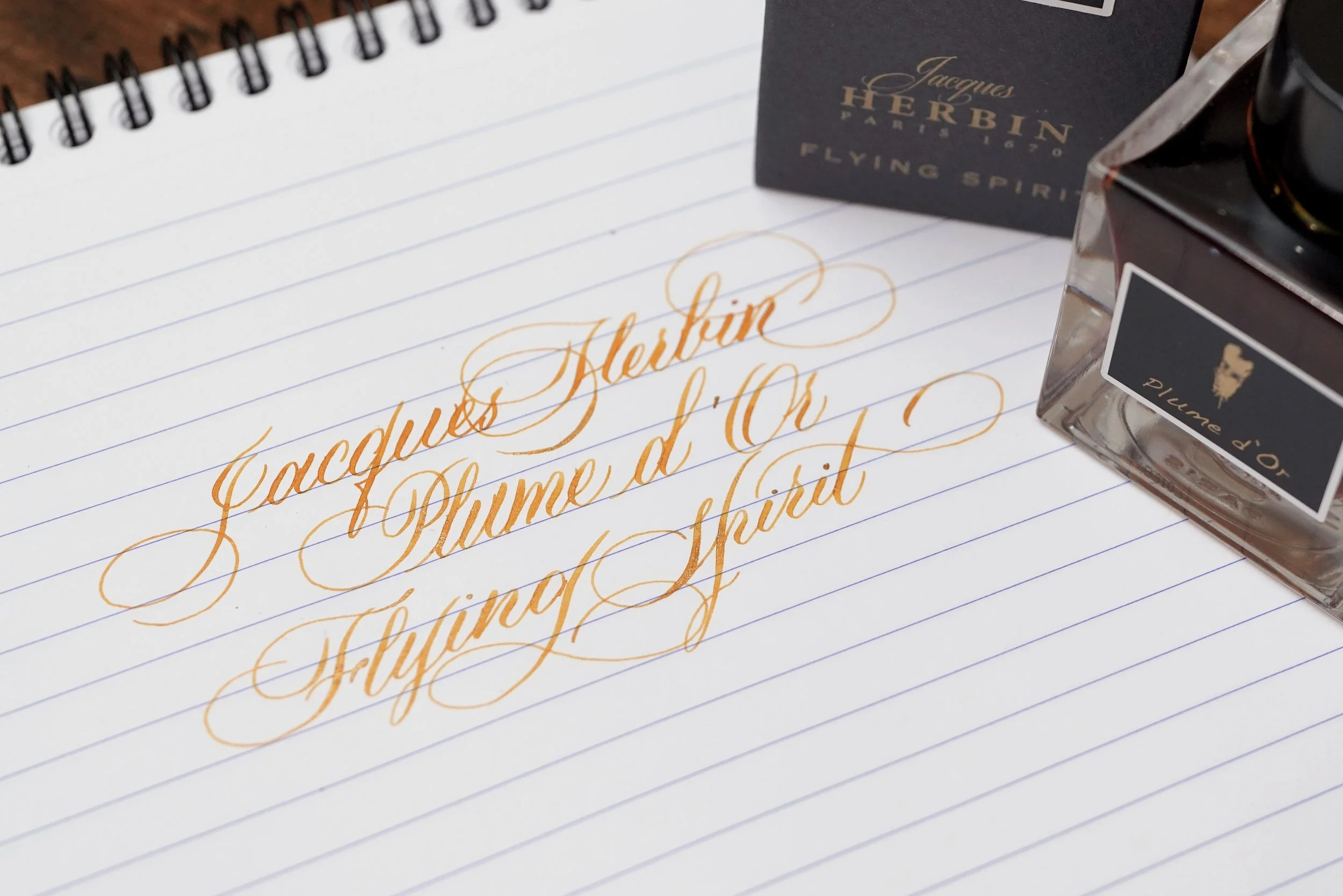
Written with the same Pilot 912 FA that started my flex nib calligraphy journey